 I haven't been doing too much illustration art this past week because I've finally started working on the music side of the OilCan Drive project.
Unfortunately, it means there isn't a lot I can show on a daily basis. It's hard to say, "look at this guitar riff I played today!" Well, I guess I could do that and show you a screen shot of the wav. file but it really wouldn't amount to much, would it?
But, after assaulting my ears all day with heavy bass and guitar riffs I took the night off, did some thumbnail sketches for the OilCan Drive covers, and tried to come up with a solution to a problem I'll have when printing the book.
The finished sleeve I'll be doing to hold the entire project will mimic a 7"x7" album sleeve. To save money on costs I'll be printing this sleeve on an 8.5"x14" piece of cardstock and folding it in half. So, I have no wiggle room on the width to make the 7" side. The problem is that the printing will leave off about an eight an inch of color. So, if I just printed the sleeve I'd have a white stripe running up the edge of the sleeve. The question is, what kind of creative thing could I do to make it look like it's supposed to be white?
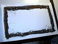
So, my first idea was to make a mask by hand using ink, brushes, spatter, and whatever else I could get my hands on. I'm not a big fan of letting Photoshop do the work for me and I like mixing the real world with the digital world as much as I can. So, I came up with the piece you see on my desk above.
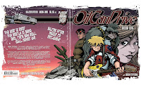
Scanning it into Photoshop I inverted the piece so the black was white and the white was black. Then, I layered the piece (using a feature where you could see though the black of the piece) on top of some existing art to test it out.
And it came out looking like this.
 So, what do you think? Do we have a winner? Will an effect like this work on the OilCan Drive sleeve, solve the problem, and still look cool.
I'm interested to know what you think.


5 comments:
I think it looks really cool! I, too, like mixing hands-on material with digital stuff, I think it gives you the best of both worlds.
Photoshop's filters and brushes tend to make everything too clean and tidy, even when you're trying to make something look ragged. Doing it by hand can really work well, as I think this does.
Btw, did you see I stole your rotating-banner idea?
Yeah, I agree with Rob, I like it alot.
Jeff
I don't understand, the goal is to make the sleeve look like an old one ? As if the record has crossed time and galaxies, is that it ?
Sounds like we have a winner. Thanks Jeff and Rob.
And, Rob,you're right, Photoshop is good but for the nitty gritty stuff it is always a little too "clean". And I did notice you lifted my idea for changing the headers out monthly. But, that's OK, I stole it from Skottie Young.
And Manu, the goal was to somehow make it look like the white edge of the sides is supposed to be there because the ink will leave an eigth of an inch of white no matter what I do. I also find if I am hand making something, folding it into place, where it may distress and crack no matter what I do, it's better to make a design that looks like it 's supposed to be that way in the first place.
Why fight the flow of life when you can just design around it?
Okay, in fact I haven't understood the word "sleeve" can be used for a book, and I haven't seen the words "book one", my fault ! :)
I thought you were talking about a record, and I had a doubt because according to me, this white around the illustration looked like snow, and so was a contradiction with the illustration itself, which showes something like desert. If I had been right, I would have told you to use a black edge because it's maybe more stellar or elegant, like a tuxedo. But that's right, it works for a book (reminds me the japanese mangas, although your drawing is far nicer :)
So we have a winner :)
Post a Comment